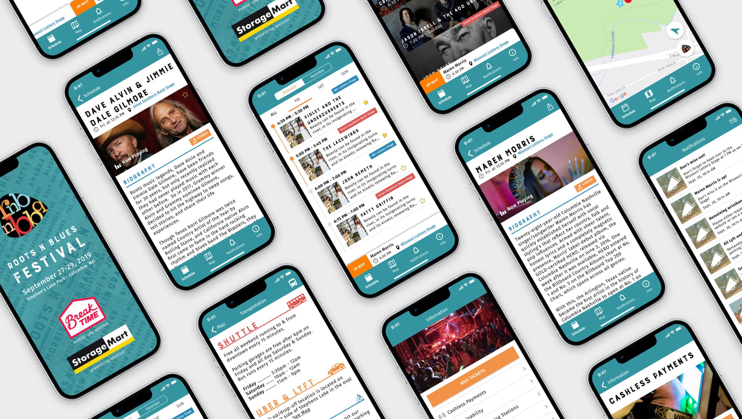
Redesigning a cross-platform app for an annual music festival in Columbia, Missouri.
UI Designer
Figma
Summer 2019

Roots N Blues N BBQ had a website, but keeping attendees informed during the festival was a persistent challenge. With frequent artist changes, venue updates, and last-minute logistical shifts, printed materials quickly became outdated. And with thousands of visitors relying on unstable wireless networks, accessing the mobile site often led to delays or timeouts.
With these challenges in mind, my primary goals in redesigning the app were to:
First, I did a light design audit of Roots N Blues’ updated website and took stock of visual elements that were being used like button styles, gradients, lines, etc. From there, I put together a "stylescape" that captured the essence, look, and feel of the brand. This helped to ensure that the experience across their owned channels and the UI of the app were consistent.

I also did a competitor analysis of apps that had features similar to the Roots N Blues app like TicketMaster, Coachella, and state fair apps. By doing this, I was able to gain an understanding of what features and functionality users expected in an events-based app, like dynamic progress bars that indicate which acts are underway and other acts that are coming up.
Throughout the project, I had to design using non-standard interface elements so it could function seamlessly on both the iOS and Android operating system.
Implemented dynamic progress bars that indicate which acts are underway and also how far along they are.
"Now Playing" and "Up Next" tickers
The dynamic progress bars were a huge hit among attendees. The festival owners also informed us that the app and its updated features were well received.
I completed this project as an intern new to the world of UX. I learned several lessons during this project, the biggest being the relationship between value and effort. There were many ideas I wanted to incorporate into the redesign, but I learned to evaluate the time and resource it would take to engineer each idea and whether that would be worth the value to the end-user. My project manager helped me implement the MoSCoW method (must have, should have, could have, and won’t have) to prioritize features, which helped me dial in on the high-priority features of the app.